


The goal of branding is to establish a connection with your ideal client, therefore, when picking your brand colours you should consider this. You can make a connection with your ideal client by choosing the right colour palette for your brand. As a result, people are more likely to trust and connect with your brand, and therefore your products or services.
You should keep a few things in mind when choosing a colour palette for your brand. Your target market’s preferred colours are the first thing you should consider. In this way, you can create a palette that speaks to them. Second, make sure the colours you choose are complementary. When this is done a cohesive appearance will be created. Finally, choose colours that complement your branding and marketing materials. As a result, your brand will be visually consistent and easily recognisable.
But how do you do this?
Colour Psychology
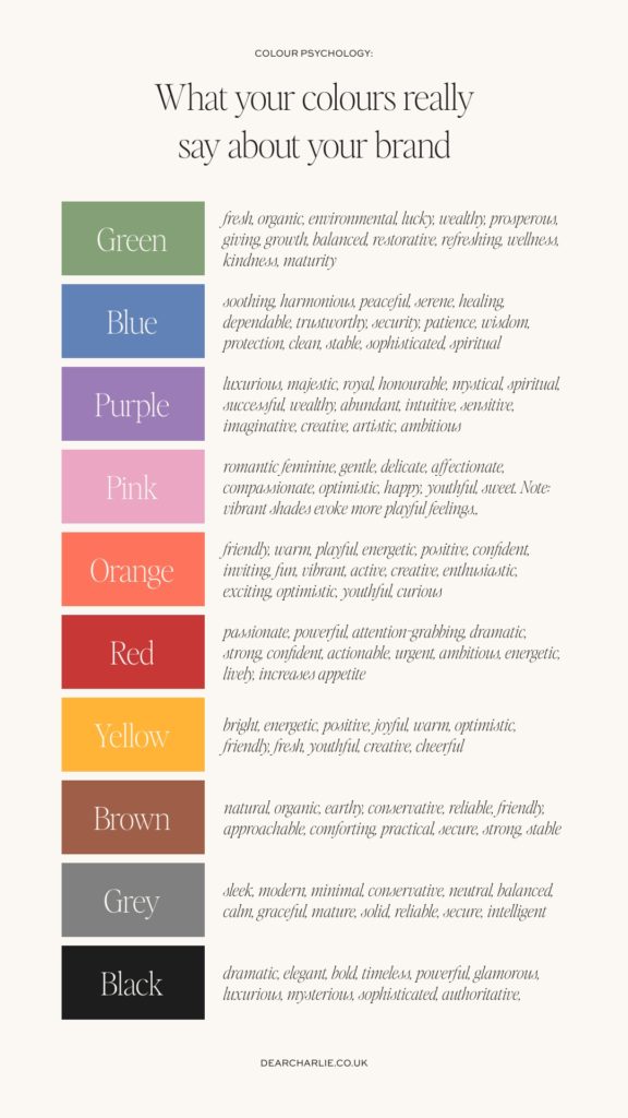
When selecting a colour palette for your brand, consider the emotion you want to evoke. Different colours are associated with different emotions and feelings. So, pick a palette that reflects the message you want to send to your customers.
E.g. Navy blue can evoke feelings of trust and dependability, while bright yellow or orange can evoke excitement and energy.
Once you have chosen a few colours that fit the criteria above, it’s important to test them out. Try putting together a few mockups of different colour combinations.
Ask your current audience what they think of the colours you have chosen, to get an idea of how they will be received. Finally, remember to keep it simple. Too many colours can be overwhelming, so pick a maximum of 6 colours that work well together.
Consistency in your brand colours
After you have chosen your ideal colour palette, you’ll want to use it consistently across all of your brand touchpoints. Make sure to use the same exact colours for all touchpoints, so that people easily recognise and associate the colours with your brand. You should have added in a few accent colours to your palette for variety. This can help break up the monotony and add interest to your materials.
Top Tip: You can also use the colours to create a visual hierarchy, directing the eye to the most important elements of your materials.
Style Guide
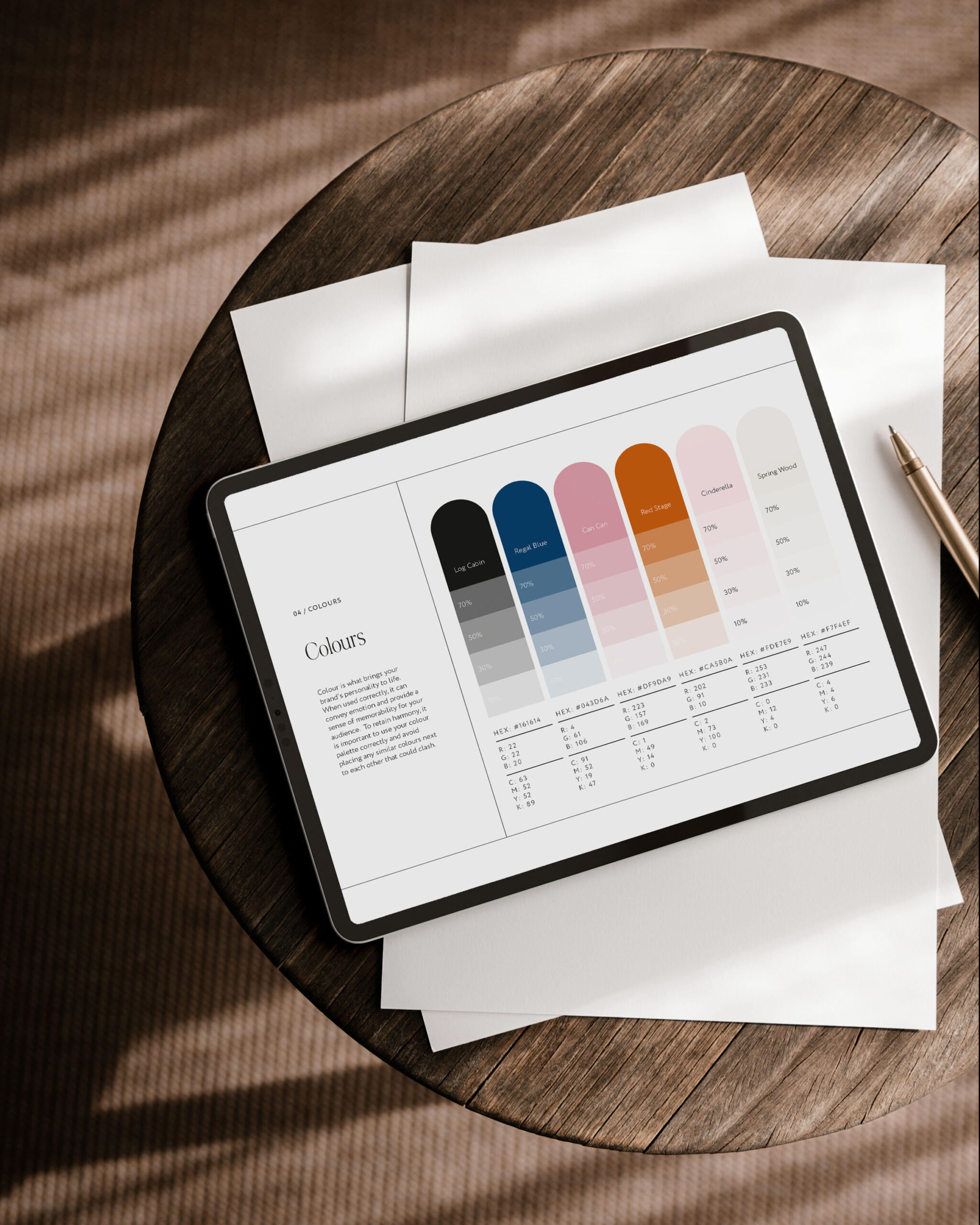
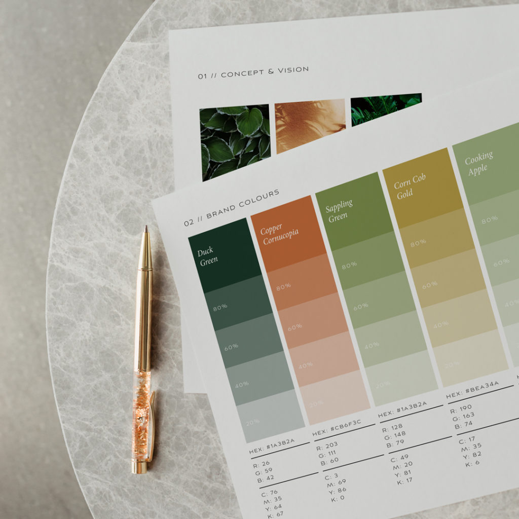
Now you have a comprehensive colour palette, make sure to document it for future use. This will help you maintain consistency in your branding and make it easier to keep track of the exact colours you should use. When creating the document, take note of the exact hex codes, CMYK values, and Pantone values of each colour. This will ensure that the colours print correctly and appear the same no matter what device they are viewed on. Additionally, include a few swatches of the colours to make it easier to visualize the palette.

Choosing the right colour palette for your brand is an important step in creating a connection with your ideal client. Consider the colours that are popular among your target market, ensure the colours you use are complimentary, and pick colours that will work well with your branding and marketing materials. Additionally, consider the emotion you want to evoke with your brand when selecting a colour palette. Once you have chosen your ideal colour palette, use it consistently across all of your branding and marketing materials, and document it for future use.
Do you have a color palette that resonates with your audience, reflects your brand’s values, and speaks to their needs? If not, you should consider reaching out to us at Dear Charlie to discuss how we can help make your brand stand out from the competition. With our expertise and experience in developing color palettes that are visually appealing, we can ensure that your brand is seen and remembered for all the right reasons. So don’t hesitate to get in touch with us today and discover how we can help you enhance your brand’s visibility.


Leave a Reply